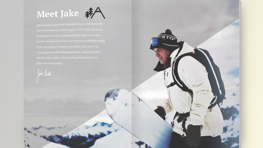
When creating any Graphic Design, there are general rules of Typography, photograph choices, and the placement of every element. I am analyzing the magazine spread from Mitch Hey Design and his Burton Snowboard Spread.
Original
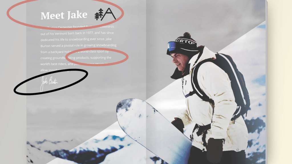
At first glance, we can see that there are many different types of typography in this element of the overall mix. With Hey Mitch’s Graphic Design, we see the rules of leading lines, the rule of thirds, and photography to get attention. Let’s break down the typography first.
Typography
He uses three type families, there is a modern, Sans-serif, and a cursive Style font. For the title he uses a modern Serif font. He utilizes a very clean sans Serif for the body copy and it ads a nice clean element when he does the cursive for the name of the company owner.
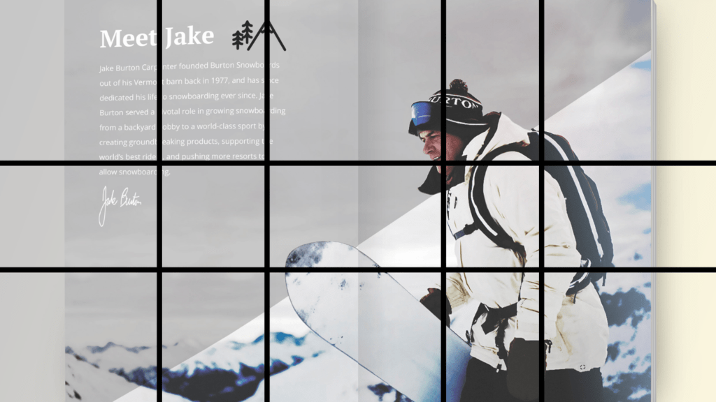
rule of thirds
You can see that every element was placed strategically inside of the design for a cohesive look that is pleasing. The paragraphs are split on the rule of thirds as well as the subject the picture. There are upward diagonal images as well to move the eyes of the person to look at the great highlight of the snowboarder and the burton logo on his hat.
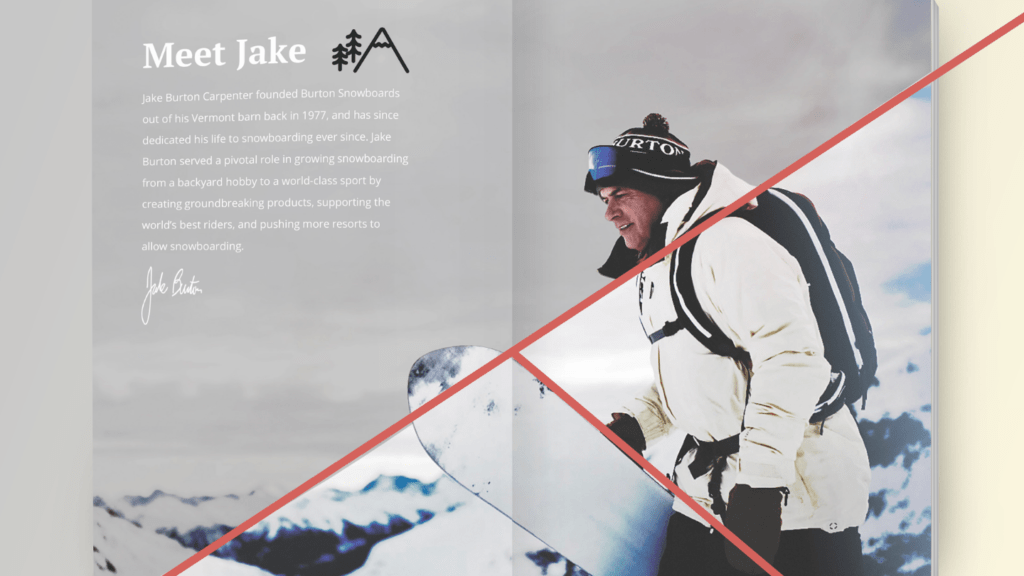
Photograph placement & My Favorite elements
The placement of diagonal lines and the clean nature of the spread are great graphic design choices. There are a lot of reasons why this particular background would work with the images below as well. If we can extract the snowboarder from the foreground, we will be able to capture the depth of field that would add a fun “In the Back Country” type feel to the mountains.
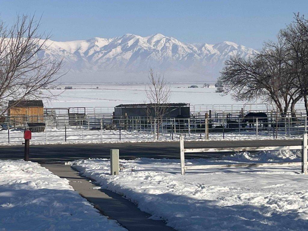
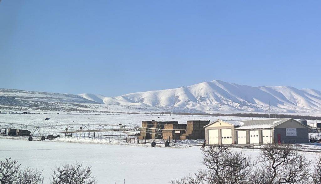
My photography
These images would be placed behind the diagonal grey overlay and behind the snowboarder to give it the look and depth of field. Given how blurry that background is and the limitations of my camera lens, there would be a little editing but the overall principle would be able to compensate for the style.
Conclusion
With all of these elements in place, there is a lot of balance, great white space and the rule of thirds that make for a very pleasing image. It has a dynamic and simple feel which is right on brand for Burton Snowboards.